
How to Use Carousel Cards to Stop Customers From Scrolling Past Your WhatsApp Messages
Most WhatsApp messages get scrolled past in under a second. Carousel Cards change that — by turning a single message into a swipeable, multi-product experience that creates curiosity, rewards attention, and drives action. This guide covers how to build them right, when to use them, and how to sequence them into campaigns that actually convert.
There's a moment that every WhatsApp marketer dreads.
You spend time crafting the offer. You get the timing right. You hit send to your broadcast list. And then — nothing. Delivered. No reply. No click. No conversation.
Not because the offer was bad. Not because the audience was wrong. But because the message looked exactly like every other message they receive every single day, and their thumb kept moving.
This is the scroll problem. And carousel cards are one of the most underused solutions sitting right inside WhatsApp.
The Real Reason People Stop Reading Your Messages
Before getting into carousels, it's worth understanding what's actually happening when a customer sees your message and decides not to engage.
WhatsApp is intimate real estate. It sits next to messages from family, friends, and colleagues. When a brand appears there, they're entering a space that people guard carefully. A wall-of-text promotion, a single image with a discount code, or a generic "check out our new offer" message — all of these look the same. They feel transactional. They don't create curiosity. They don't reward the reader for stopping.
And the consequences go deeper than just one ignored message. WhatsApp's 2026 broadcast ecosystem now tracks engagement patterns at the account level. Accounts with consistently low reply and click rates face gradual sending restrictions — meaning every ignored message isn't just a lost sale, it's actively working against your future ability to reach people. Getting someone to stop and engage isn't a vanity metric. It's account health.
That's the context in which carousel cards matter so much.
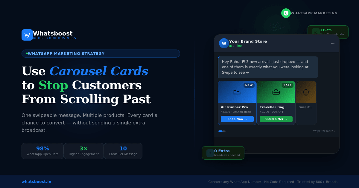
What WhatsApp Carousel Cards Actually Are
A WhatsApp Carousel is a horizontally scrollable message format that contains multiple cards — typically between 2 and 10 — within a single chat bubble. Each card can carry:
- An image or video header
- A title and body text (up to 160 characters)
- Up to two action buttons per card (Call-to-Action or Quick Reply)
Instead of sending five separate messages about five different products, you send one message that the customer can scroll through laterally — swiping from card to card the way they swipe through Instagram Stories or a product gallery on an app.
The mechanics are simple. The psychology behind why it works is more interesting.
Why the Carousel Format Triggers a Different Response
When a person receives a standard text-and-image WhatsApp message, there's one decision point: read it or don't. One stimulus. One response. Simple — and easy to dismiss.
When a person receives a carousel, something different happens. They see the first card. They notice the edge of a second card peeking in from the side. That visual cue — the partial visibility of something they haven't seen yet — creates what behavioral psychologists call an open loop. The brain wants to complete the pattern. It wants to see what's next.
This is the same mechanism that makes Netflix episodes autoplay and Instagram carousels get higher engagement than single-image posts. Partial information creates the pull. The format does the work before the content even registers.
And once someone starts swiping through your carousel, they're committed. They've invested attention. They're in a browsing mode rather than a scrolling-past mode. That shift in mental state is where conversions happen.
The Business Cases Where Carousels Outperform Everything Else
Not every message needs to be a carousel. But there are specific situations where the format provides a structural advantage that a flat message simply cannot replicate.
Product line showcases. When you have multiple products in a category — different variants, sizes, price points — a carousel lets customers browse without leaving WhatsApp. A clothing brand showing three jacket styles. A food delivery business showing their top five meal combos. A skincare company displaying a morning routine product sequence. Each card handles one product, and each card has its own "Shop Now" button. A customer who isn't interested in the first product might convert on the third. With a flat message, that third product never gets seen.
Step-by-step storytelling. Some offers need context before they convert. A coaching program that explains the problem on card one, the solution on card two, the proof on card three, and the CTA on card four. A software tool that shows the before state, the feature, the result, and the trial link across four sequential cards. The carousel format enforces a narrative structure that a single long-form message loses.
Comparison selling. If you offer different plans, tiers, or packages, a carousel is the cleanest way to present them side-by-side without making the customer do mental math. One card per plan. Each with the key benefit and a direct button. Customers can swipe back and forth and self-select based on what they see, reducing the need for a sales conversation to explain the difference.
Re-engagement campaigns. Customers who went quiet are the hardest audience to win back with a generic message. A carousel that presents multiple "reasons to return" — a new product they haven't seen, an updated offer, a testimonial, a relevant piece of content — gives the campaign multiple attempts within a single message. Even if the first card doesn't land, the third might.
How to Build a Carousel That Actually Converts
There's a difference between creating a carousel and creating one that works. Most businesses get the format right and the content wrong.
Lead with your strongest card, not your most complete one. The first card is not where you dump all the information. It's where you create the hook — the image or headline that makes someone want to swipe. Think of it like a book cover. Its job is not to tell the story. Its job is to make you want to open it. Use a striking visual, a bold claim, a specific number, or a question that creates immediate relevance. "3 new arrivals you haven't seen yet" is a stronger first card than a detailed product description with specifications.
Keep the copy on each card to one idea. The 160-character body limit on carousel cards isn't a restriction — it's a feature. It forces clarity. One product. One benefit. One action. When each card is disciplined about its single idea, the overall carousel feels clean and easy to consume rather than overwhelming. If you find yourself trying to say multiple things on one card, that's a signal to split it into two cards.
Make the button text specific, not generic. "Click Here" is not a button. "Claim This Offer," "See This Dress," "Get My 20% Off," "Book This Slot" — these are buttons. The specificity of the button text reduces friction because it tells the customer exactly what will happen when they tap it. Generic CTAs create hesitation. Specific CTAs create momentum.
Match the visual language across all cards. A carousel that looks inconsistent — different image styles, different color palettes, mismatched fonts — signals disorder. Customers process visual coherence instantly and emotionally. A consistent card design tells the customer that this is a professional brand that has thought about what they're seeing. Inconsistency does the opposite.
Design for the swipe, not just the read. Since part of the next card is always visible, the right edge of each card is essentially an advertisement for the next one. Don't put the most important information at the far right of your card image — it'll be partially hidden. Put your primary visual and headline centrally. Use the peeking edge to create curiosity without giving away the next card's content.
Message Template Strategy: What to Pair With the Carousel
A carousel is a format, not a complete message strategy. The text that sits above the carousel — the message body before the cards begin — is critically important and often underestimated.
This top section has one job: get the customer to swipe the first card. It should be short (two to three lines maximum), conversational, and create a specific reason why this particular person should care right now.
Weak: "Check out our new products below!"
Strong: "3 new arrivals just landed — and one of them is exactly what you were looking at last week. Swipe to see which one."
The difference is specificity and personal relevance. Even if the second version isn't literally true for every recipient, the phrasing creates a sense of intentionality — this feels curated for the reader, not blasted at a list.
This kind of message design is what separates WhatsApp campaigns that consistently hit 50%+ open and response rates from campaigns that disappear into the noise. The format creates the opportunity. The words create the conversion.
Sequencing Carousels Into Your Broader WhatsApp Strategy
The most effective use of carousel cards isn't as one-off broadcasts. It's as a deliberate stage in a sequenced customer journey.
Consider a customer who receives a carousel showcasing three products. They swipe through. They tap the button on card two. They browse the product — but don't purchase. That action is data. That customer has told you exactly what they're interested in.
The next message they receive shouldn't be another generic broadcast. It should be a targeted follow-up — a message that references what they looked at, adds new information (a review, a limited stock warning, a complementary product), and gives them a clear path back to the decision.
This is where WhatsApp retargeting campaigns built around behavioral signals become the multiplier — the carousel starts the conversation, and the retargeting sequence closes it.
The businesses seeing the highest returns from carousel cards aren't using them in isolation. They're using them as the entry point into a structured customer journey where every subsequent message is informed by how the previous one was received.
Segmentation: The Hidden Lever That Makes Carousels More Powerful
Sending the same carousel to every contact on your list is better than sending a flat message. But sending a segmented carousel — one that's been tailored to different customer groups — is a different category of performance.
A returning customer who bought from you three months ago should receive a different carousel than a cold lead who subscribed to your list last week. The returning customer responds to loyalty signals, new arrivals, and "we thought of you" framing. The cold lead responds to social proof, introductory offers, and simplicity.
This isn't a complex operational requirement. It means having two or three carousel variants rather than one, and routing them to the right contact segments before sending. The additional setup time is minimal. The difference in response rates is not.
Segmented messaging combined with rich interactive formats like carousels is one of the 19 WhatsApp marketing strategies that consistently drive measurable business results — especially for brands operating in competitive categories where every engaged customer represents significant lifetime value.
Common Carousel Mistakes That Kill Engagement
Understanding what works means also understanding what quietly kills an otherwise good campaign.
Using too many cards. The maximum is ten, but that doesn't mean ten is the right number. Three to five cards is the zone where engagement stays high throughout the carousel. Beyond that, most customers drop off before reaching the final cards — meaning those cards may as well not exist. If you have ten things to show, send two separate carousels at different times rather than one exhausting one.
Making every card identical in structure. If all five cards have the same layout, same image type, same amount of text, and same button — swiping feels pointless. Introduce intentional variation. Card one might be a hero image with minimal text. Card two might be text-heavy with a supporting image. Card three might be a testimonial. The variation rewards the swipe because each card offers something slightly different.
Treating the carousel as the entire strategy. A carousel that goes out to an audience that has never heard of you, received no prior context, and has no relationship with the brand will underperform regardless of how well-designed it is. Carousels work best within relationships. The warmth of prior interaction — even a single previous message or opt-in — dramatically changes how the carousel is received.
Neglecting the mobile visual experience. WhatsApp carousels are consumed almost entirely on mobile screens. Images that look balanced on a desktop are often off-center or poorly cropped on a phone. Every card image should be previewed on an actual mobile device before the campaign goes live. What looks like a compelling product shot on a 27-inch monitor might crop the product out entirely on a 6-inch screen.
How Whatsboost Enables Carousel Campaigns Without the Technical Complexity
Building WhatsApp carousel templates requires Meta template approval, proper API configuration, and the ability to map dynamic content to individual card variables. For most businesses without a dedicated technical team, that process is a significant barrier.
Whatsboost removes that barrier. The platform handles template creation, Meta submission, approval management, and delivery — so the business focuses on the strategy and creative, not the technical scaffolding. You build your carousel cards visually, set up your audience segments, define your follow-up triggers, and the infrastructure handles the rest.
This is particularly valuable for businesses that want to move from a single carousel broadcast to a fully sequenced campaign — where the carousel is card one of a multi-touch flow, and every subsequent message is triggered by what the customer did or didn't do with the previous one.
If you want to see how carousel-based campaigns actually look in a live setup before committing to a full build, booking a walkthrough with the Whatsboost team is the fastest way to go from concept to a working campaign.
The Bottom Line
The scroll problem isn't going away. Customers are receiving more messages, from more businesses, on more channels than ever before. The ones that cut through aren't necessarily the ones with the biggest budgets or the most aggressive send frequencies. They're the ones that respect the customer's attention enough to make stopping feel worth it.
Carousel cards are a structural answer to that challenge. They create curiosity through partial visibility. They reward exploration through varied content. They give multiple products or ideas a fair chance within a single interaction. And when built correctly — with a strong lead card, disciplined per-card copy, specific CTAs, and a sequenced follow-up — they turn a broadcast list into an active customer conversation.
Your customers are already on WhatsApp. The question is whether your messages give them a reason to stop.
Want to automate WhatsApp for your business?
Set up campaigns, replies, and follow-ups in minutes.